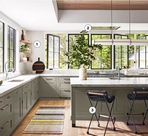
Management consultant-turned-designer Sarah Robertson always approaches her projects with a can-do mindset. Take this 1910 Queen Anne home in New York’s Westchester County, for example: Originally, it held a dark and cramped kitchen. The backyard, on the other hand, was totally dreamy. So the owners reached out to Robertson, whose firm, Studio Dearborn, has specialized in kitchens for more than a decade. Working with Stoll & Stoll Architects, she moved the kitchen to the back of the house, where it looks out onto the greenery.
To make the room feel expansive, they bumped up the roofline to create a wood-paneled tray ceiling and added eight windows (whose black-painted frames look like iron for a fraction of the cost). Robertson assigned storage to lower cabinets, drawers, and one wall. “We wanted that open connection to the backyard,” she explains, “and I like to maximize storage.” Here, everything has its place, all tucked within the cabinets Robertson designed with Schrocks of Walnut Creek, the undercabinetry painted in Benjamin Moore’s Rockport Gray. “It’s a historic house, so this color felt more right than white,” says the designer, who opted for modern hardware by Foundryman and DLV Design for “a cleaner, transitional vibe.” With a view this nice, why ever go outside?
- Go Blond “We wanted to keep it earthy and natural,” Sarah Robertson says of the room’s soothing palette.
- Hide the Hood The blowers were inset into the ceiling for a streamlined look, and to maximize views.
- Sit Pretty Vintage Cleo Baldon counter chairs were reupholstered in black cowhide.
Cover It Up
Chevron paneling on the pantry and matching Sub-Zero fridge and freezer creates a symmetrical design.
Countertop Storage
“We wanted to make it feel cohesive,” Robertson says of the full wall of cabinetry. Pull-down panels—complete with brass hardware by Foundryman—hide small appliances.
Built-In Pantry
Snacks take up lots of space, so Robertson devised a pantry with tray shelves (which pull out so items in the far back are easily accessible) to stash all manner of dry goods.
Custom Drawers
Robertson designs all her cabinets with Schrocks of Walnut Creek, an Amish company in Ohio. This pull-out caddy for cooking utensils is conveniently situated beside the range.
Hidden Brilliance
Rather than taking up another drawer, a drying rack and cutting board are stashed between lower cabinets—they slide out easily thanks to sturdy leather pulls.
Follow House Beautiful on Instagram.
https://www.housebeautiful.com/design-inspiration/house-tours/a29401337/sarah-robertson-studio-dearborn-kitchen/
2019-10-22 10:00:00Z
CBMicGh0dHBzOi8vd3d3LmhvdXNlYmVhdXRpZnVsLmNvbS9kZXNpZ24taW5zcGlyYXRpb24vaG91c2UtdG91cnMvYTI5NDAxMzM3L3NhcmFoLXJvYmVydHNvbi1zdHVkaW8tZGVhcmJvcm4ta2l0Y2hlbi_SAQA
Bagikan Berita Ini


0 Response to "Sarah Robertson Is House Beautiful's Nov 2019 Kitchen of the Month - HouseBeautiful.com"
Post a Comment